
Impact of Color Contrast in Athletic Apparel on Performance

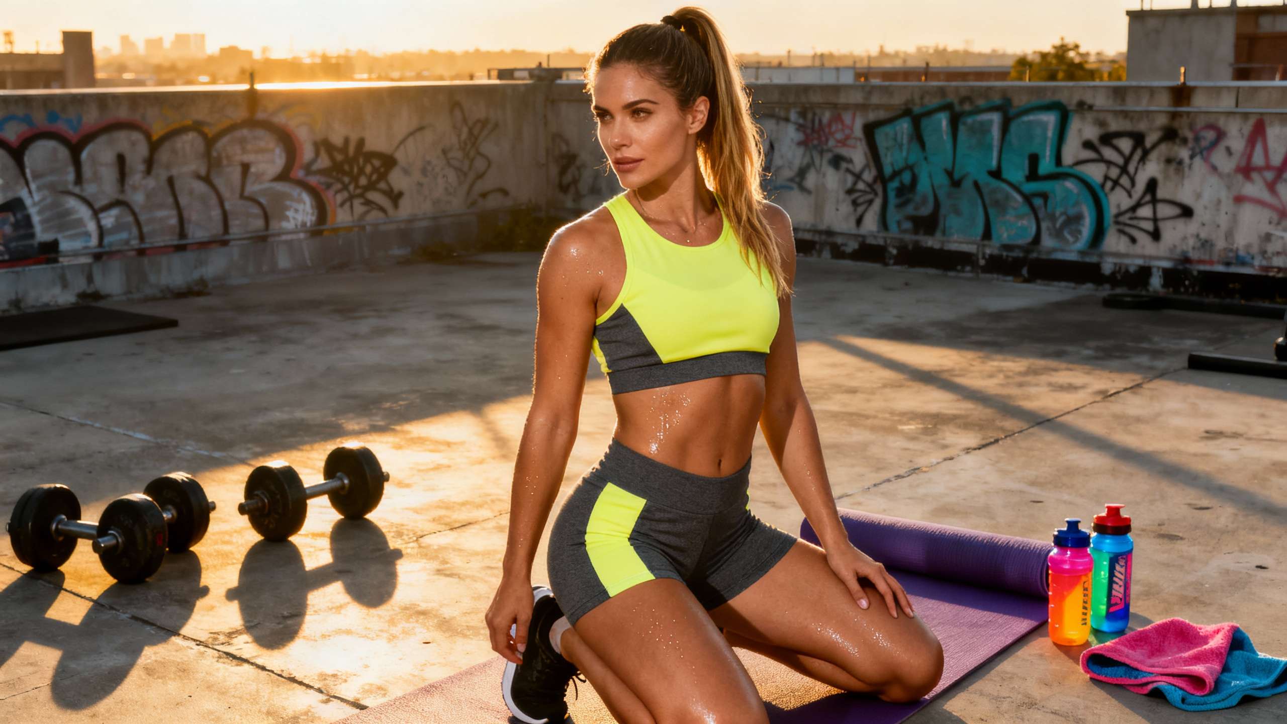
Table of Contents
- What Color Contrast Really Means in Performance Gear
- Visibility, Safety, and Split-Second Decisions
- On-Field Recognition and Legibility
- Accessibility and Colorblind Athletes
- Outdoor Adventure and Environmental Contrast
- Psychology: How Color Contrast Primes The Athlete
- Warm and Cool Contrasts as Mental Fuel
- Red, Blue, and the Competitive Edge
- Emotional Self-Tuning Through Color Blocking
- Simplicity, Harmony, and Brand Identity
- Designing High-Contrast Kawasaki Performance Gear
- Pros and Cons of High-Contrast Color Schemes
- FAQ: Color Contrast and Performance
- References
You feel it every time you drop into a dark forest singletrack in a neon jersey, or line up under stadium lights with a number that pops off your back. Color is not just a style choice; the contrast in your apparel can change how fast teammates find you, how quickly officials read your number, how opponents perceive you, and even how you feel in the moment before sending it. As someone who spends workdays tuning Kawasaki performance kits and weekends chasing dirt, rock, and snow, I can tell you: get color contrast right, and you unlock free performance.
This is not guesswork. Apparel manufacturers, sports psychologists, and league rulebooks all treat color contrast as a serious performance variable. Let’s break down how it works and how to use it in your own gear choices and designs.
What Color Contrast Really Means in Performance Gear
When most athletes talk about color, they focus on the hue: red, blue, green, neon yellow. Designers and performance engineers have to think deeper. Color has three key attributes that matter for gear: hue, saturation, and value.
Hue is the family of the color itself, like red or blue. Saturation is how intense or muted that color looks. Value is how light or dark it appears. Articles from apparel specialists such as Bella+Canvas and Modaknits Apparel emphasize that once you start adjusting saturation and value, you can create a whole range of tones from the same hue, from soft pastel lavender to deep, almost-black purple.
Color contrast is the difference between two areas along any of those dimensions. A bright white number on a deep green jersey has high value contrast. A neon yellow sleeve on a charcoal jacket has contrast in both value and saturation. Even two dark colors can contrast through hue, like a deep Kawasaki green panel against navy.
In high-performance apparel, color contrast shows up in three main ways. First, between the athlete and the environment, which affects visibility and safety. Second, between apparel elements themselves, such as numbers and logos against the jersey body, which affects legibility and officiating. Third, between the colors of different teams or athletes, which affects both perception and fairness.
Color harmony sits alongside contrast. Fashion-focused manufacturers explain that designers rely on the color wheel to build harmonious schemes: monochromatic palettes that vary light and dark within one color, analogous schemes that pair neighbors like blue and green, or complementary pairs across the wheel like red and green. They repeatedly warn that the more colors you pile into a design, the harder it becomes to keep it visually balanced. That warning is not just aesthetic; overloaded color schemes can hurt performance.

Visibility, Safety, and Split-Second Decisions
When I test high-speed trail or moto kits, I care first about whether a teammate can spot me instantly at 30 mph or more, and whether a driver or rider can separate me from the background at a glance. That is pure contrast.
On-Field Recognition and Legibility
In team sports, Morningstar Screen Printing points out that players, fans, and referees must be able to distinguish jerseys instantly. Strong contrast between uniforms is not a fashion suggestion; it prevents confusion and collisions. You rarely see two football teams run out in nearly identical shades, because both leagues and broadcasters recognize the cognitive chaos that creates.
A performance apparel company like Wooter Apparel takes this even further, grounding jersey design in measurable contrast ratios. For numbers and text, they recommend aiming for a contrast ratio similar to digital accessibility standards, with higher contrast for smaller elements. In practice, that translates into very light numbers and lettering on very dark fabrics, or the reverse, not medium gray on slightly darker gray. They also emphasize bold, simple fonts and clean spacing around numbers so contrast can actually do its job.
Regulations in major sports back this up. Soccer, basketball, and football uniform rules all demand large, high-contrast numbers on front and back, as well as clear differentiation between home and away kits. These rules are effectively saying that legible, contrasting colors are part of the performance system: players must be trackable, substitutions must be correct, fouls must be attributed, and broadcast viewers must follow the game.
Accessibility and Colorblind Athletes
Contrast is not only about people with typical color vision. Wooter highlights a critical statistic: roughly eight percent of men live with red–green color blindness. If a league relies heavily on red versus green uniforms to differentiate teams, that system fails a nontrivial share of players and fans.
That is why modern jersey design avoids red–green pairings for core distinctions and treats accessible color contrast as a performance, safety, and inclusivity requirement. Designers increasingly use digital tools such as contrast checkers and color vision simulators to verify that their color combinations remain distinguishable for colorblind viewers. As a gear designer, that means you cannot just eyeball your mockup on a bright monitor and call it good; you need to test how your colors will look under different eyes and lighting.
Outdoor Adventure and Environmental Contrast
Take the conversation off the field and into the backcountry. The terrain is your background, and the stakes can be higher. Wooter notes that neon orange often stands out best in natural environments, while lime or bright yellow tends to pop against urban backgrounds. I have seen the same on trail: a rider in a muted green jacket on a pine-lined ridge can disappear in seconds, while a neon yellow shell reads like a beacon from hundreds of feet away.
Morningstar also points to a functional layer: dark colors absorb more heat, which can be punishing in summer desert rides or long days on exposed rock. Light colors reflect more sun and keep athletes cooler but show dirt and stains faster. Fabric finish matters as well. Matte material absorbs light differently from shiny; a glossy emerald may flare in sunlight and lose legibility, while matte panels stay more consistent and easier to read under a wide range of conditions.
For Kawasaki-style adventure gear, this becomes a three-way tradeoff. You want high-contrast visibility against the terrain when you are ripping a fire road or navigating a busy trailhead, thermal management that fits the climate, and a palette that still feels aggressive and fast. A smart solve is often a darker, stealthy base with sharp blocks of neon yellow, orange, or electric green placed high on the body, helmet, and pack—areas that stay visible above brush and snow.

Psychology: How Color Contrast Primes The Athlete
Visibility is only half the story. Color contrast also hits your nervous system before you even clip in.
Warm and Cool Contrasts as Mental Fuel
Color psychology research in sportswear, described by brands like LOA Sport, TD Sportswear, and Faxaze, treats color as a psychological tool. Warm colors such as red, orange, and bright yellow are repeatedly associated with energy, aggression, vitality, and optimism. TD Sportswear describes red as a powerful, performance-boosting color linked to higher heart rate and adrenaline, commonly used in combat and intense contact sports. The same article highlights yellow as cheerful and highly visible, supporting enthusiasm and quick reactions, especially in team sports and cycling.
Cool colors such as blue and green tend to express calmness, balance, and focus. TD Sportswear frames blue as a “fashion for focus” color for sports like swimming, archery, and golf because it reduces stress and helps regulate breathing, which can stabilize performance under pressure. Green appears in several sources as a symbol of balance and harmony, recommended for precision sports and for outdoor disciplines where athletes want to feel connected to nature while maintaining mental clarity.
Fashion-forward brands layer this with more nuanced shades. LOA Sport describes champagne as a color of understated luxury and celebration, perfect for athletes who see fitness as a joyful journey rather than a grind, while neon yellow signals high energy and a zest for life. Other sources highlight lavender and pastel purples as colors of peaceful precision, suited to yoga, Pilates, and disciplines that demand internal balance more than raw aggression.
When you build a kit with high contrast between warm and cool elements—a neon yellow chest panel on a deep charcoal base, or a bold red accent cutting through a navy shell—you are not just making yourself easier to see. You are dialing in a mental message every time you catch your reflection or glance down at your sleeves.
Red, Blue, and the Competitive Edge
Few colors have been studied as aggressively in sport as red. A well-known study by Hill and Barton, summarized in a Samford University sports analytics article, examined one-on-one boxing, taekwondo, Greco-Roman wrestling, and freestyle wrestling in the 2004 Olympic Games. Athletes were randomly assigned red or blue uniforms. Across all bouts, competitors in red won about 55 percent of the time. In closely fought matches where the point difference was small, red’s winning percentage rose to roughly 62 percent. In those narrow margins where many contests are decided, color was enough to tilt the balance.
The same Samford piece notes that athletes in red scored significantly higher on aggression and dominance metrics than those in blue or gray. Separate summaries from Wooter Apparel point to additional findings: English soccer teams in red have been reported to win nearly ten percent more matches than teams in other colors in some datasets, and fighters in red gear have won about 65 percent of Wushu sanda bouts in China. Norbert Hagemann’s taekwondo research, referenced in Wooter’s color psychology article, even found that when video footage was digitally recolored, fighters shown in red received about 13 percent more points from judges than the same fighters shown in blue.
However, a critical review of uniform color effects in sports, summarized in research overviews on platforms like ResearchGate, warns that these effects are modest and inconsistent. When analysts combine data across many studies, they usually find small effect sizes and plenty of conflicting results. Methodological critiques note that early work sometimes failed to control for team strength, seeding, and non-random uniform assignments. A meta-analysis mentioned in Wooter’s review of 69 studies concludes that color has limited direct impact on raw physical performance, but stronger effects on emotional regulation, perceived dominance, and bias in officiating.
That tension matters for athletes. You should not expect a red jersey to add twenty watts to your sprint. But if red contrast makes you feel more assertive and at the same time nudges referees to see you as slightly more dominant in a scramble, that is still a performance edge. Conversely, black uniforms, often chosen for their power and intimidation, have been associated in some analyses with higher penalty rates in sports like hockey and football, suggesting that strong dark contrasts can cut both ways.
Emotional Self-Tuning Through Color Blocking
Modern sportswear design leans heavily on color blocking: large, contrasting color fields placed in geometric patterns. Faxaze, writing about color block sports bras, notes that asymmetrical, high-contrast layouts can subconsciously stimulate effort and focus, creating a sense of movement and competitiveness before you even start your workout. When those blocks use energizing hues like red or orange on key visual zones—chest, shoulders, hips—they can help you feel more switched on.
LOA Sport takes a more narrative angle, urging athletes to choose colors that express the story they want to live. Neon yellow is for manifesting a more energetic life; champagne is for treating the workout as celebration; gray is for balanced minimalism; black is for unapologetic confidence. Even lavender palettes, described in another article as “peaceful precision,” can help athletes stay emotionally steady in precision disciplines.
In practice, that means you can use contrast to tune your mindset deliberately. If you are racing a downhill course, you might pick a red-and-black kit with sharp value contrast and aggressive blocking to help you feel like a threat at the gate. If you are logging long endurance miles, a green and deep blue combination with smaller neon accents might keep you calm and locked in without turning down your visibility.

Simplicity, Harmony, and Brand Identity
After a few decades of working with team and consumer gear, I have learned that the most effective high-contrast designs are brutally simple.
A study reported by Ohio State University followed 142 consumers as they designed their own Nike Shox shoes on a customization site. Each shoe had seven components that could be colored, with up to sixteen colors available across the design. Statistically, participants could have ended up using more than five different colors if they chose at random. Instead, they averaged about four, and they tended to reuse the same color on multiple elements or pick very closely related shades, like pairing pale and deep blues. Very few people used far-apart colors on the same shoe, and when they did, they often reserved a single small area, such as the cushioning columns, for a bold contrasting “signature” color.
For apparel designers, that experiment confirms what Bella+Canvas and Modaknits teach: a limited palette of two or three main colors plus one accent is easier on the eye, feels more professional, and usually sells better. A strong single accent—like Kawasaki green piping on an otherwise black shell, or a neon yellow shoulder panel on a charcoal base—creates focal contrast without turning the garment into a visual shout.
From the branding side, Marathon Sportswear compares brand identity to a fingerprint and argues that color sits at the center of that fingerprint. Red signals energy and action, blue communicates trust and calm, earthy neutrals express sophistication or sustainability. Morningstar adds that long-established teams treat their colors as almost sacred; experiment too far and fans revolt. Wooter notes that in English soccer, most clubs gravitate toward red or blue as their primary color, and Samford’s analysis shows that a large share of MLB, NBA, and NFL teams lean on red-and-blue schemes for the same reason. These hues are visible, emotionally loaded, and instantly recognizable.
Color contrast is the amplifier for that identity. A muted red with low contrast on a dark background feels sleepy. A deep, saturated red framed by sharp white or black lines feels fast and aggressive. The difference is contrast, not just the basic hue.

Designing High-Contrast Kawasaki Performance Gear
Translating all of this theory into gear you actually ride, run, or lift in means weaving contrast into the entire design process.
Performance-focused manufacturers like Gear Team Apparel outline a clear workflow that adapts well to Kawasaki-style gear. Everything starts with understanding the athlete and the environment. You look at sport, level, conditions, and preferences. A motocross rider hammering outdoor tracks in summer heat needs different contrasts than a mountain athlete trail running through mixed forest shade.
Once the athlete profile is clear, you define the brand and personal identity. Are you designing for an aggressive, win-at-all-costs program or a community trail crew built around resilience and exploration? High-contrast red and black might fit the first. Deep green, black, and a single neon accent might suit the second.
From there, fabric choices and construction details come in. Polyester blends hold bright, high-contrast color well and resist fading, which is why they dominate technical jerseys and outer shells. Panels and seams can be placed to create natural color blocks that enhance movement and visibility. Sublimation printing allows all-over designs that keep the fabric light, so you can run sharp contrasts across an entire body without adding awkward weight.
Then comes color palette selection and the technical documentation. Designers build a concise palette using primary, secondary, and possibly tertiary colors, with one dominant hue and one or two accents. They specify color codes in tech packs alongside measurements, stitching, and placements for logos and numbers so manufacturers can reproduce the contrast faithfully.
Finally, they test. Quality control samples go out to athlete testers and staff. We ride them under tree cover, open sun, and stadium floodlights; photograph them from the stands and from drone height; check legibility at distance; and sometimes film scrimmages to see how quickly players pick out teammates in peripheral vision. Adjustments—such as brightening numbers, deepening the base color, or shifting an accent—happen based on this real-world feedback, not just the designer’s monitor.
To make these principles more concrete, here is how different contrast goals often translate into palette strategy in performance and adventure gear:
|
Scenario |
Primary contrast goal |
Palette strategy example |
|---|---|---|
|
Fast team sport under lights |
Rapid player recognition and clear numbers |
Dark base jersey with bright, light numbers and one high-energy accent |
|
Backcountry trail or adventure riding |
Visibility against natural terrain and safety |
Charcoal or dark green base with neon orange or yellow on upper-body zones |
|
Precision or endurance performance |
Calm focus with readable branding |
Deep blue or green base, subtle contrast numbers, small energizing accent |
|
Lifestyle-athletic crossover for daily wear |
Brand identity with versatile styling |
Neutral base (black, gray, champagne) with restrained, high-contrast trim |
The exact hues will shift with brand and athlete identity, but the underlying logic stays the same: one dominant base, strong contrast where it matters most, and minimal but impactful accent color.

Pros and Cons of High-Contrast Color Schemes
High-contrast palettes are powerful, but they are not universally positive. Designers and athletes need to understand both sides.
On the plus side, contrast dramatically improves visibility and legibility. Strong differences between jersey and environment reduce collisions, make it easier for teammates to find each other, and help officials track numbers and calls. Contrast also supports inclusion, since carefully chosen combinations remain distinguishable for colorblind viewers. Psychologically, bold contrasts, especially with warm colors, can increase feelings of energy and dominance, which may improve performance in close contests. For brands, high contrast can create iconic looks that fans recognize instantly from the stands or a social media scroll.
The downsides emerge when contrast is mishandled. Bella+Canvas cautions against “vibrating” combinations such as red on blue or red on orange at similar brightness levels; they can be visually irritating and hard to focus on, which is the opposite of clarity. Overly busy multicolor schemes make it tough to maintain visual balance and may turn off consumers who, as the Nike customization study showed, tend to prefer simple, coordinated palettes with at most one intense accent.
There is also a behavioral risk. Dark, heavily contrasting kits, particularly in black, can increase perceived aggression to the point where officials penalize teams more often, as some analyses of hockey and football suggest. And high-contrast, neon-heavy designs can feel too loud for athletes who want their gear to flow easily from the trail or gym into everyday settings.
In short, contrast is a tool, not a religion. The goal is purposeful contrast that serves visibility, psychology, and identity, not contrast for its own sake.

FAQ: Color Contrast and Performance
Q: Does wearing red actually make me perform better, or is it just hype? A: The best summary from reviews of many studies is that red does not magically increase your raw physical capacity, but it consistently affects emotion and perception. In combat sports and soccer, red has been linked to higher win rates in some datasets, more aggressive self-reports, and even scoring biases from referees. At the same time, broader critical reviews find these effects to be small and not always replicable. In practice, red can give you a psychological nudge and perhaps a slight edge in close contests, but training, tactics, and skill still dominate.
Q: Should I avoid red and green together in my kit? A: For anything that must be distinguished quickly—team versus team, jersey versus environment—pairing red and green is risky because a significant share of men cannot reliably separate those hues. If you love red, pair it with white, black, or deep blue instead. If you want green, contrast it with white, black, or bright yellow. Save red–green combinations for small accent details that do not carry critical information.
Q: For backcountry adventure riding and trail exploration, what matters more: bright color or high contrast? A: They are both important, but contrast against your environment is the true performance variable. Neon orange is highly visible in forests and mountain terrain; neon yellow or lime pops more in gray urban landscapes and rainy conditions. A muted jacket with a single neon panel may still be harder to spot than a mid-tone jacket with broad, high-contrast blocks on chest, shoulders, and back. When in doubt, photograph yourself or your group from a distance in the terrain where you ride or run and see which color contrasts actually jump out.
Step onto the trail, track, or tatami in gear that works as hard as you do. Treat color contrast as part of your performance setup, right alongside suspension, tire choice, and conditioning. Choose the hues that sharpen your visibility, tune your mindset, and carry your story, and then go test them in real terrain. I will see you out there, bright, bold, and impossible to miss.

References
- https://www.academia.edu/15738076/Influence_of_red_jersey_color_on_physical_parameters_in_combat_sports
- https://repository.lsu.edu/cgi/viewcontent.cgi?article=6757&context=gradschool_theses
- https://news.osu.edu/consumers-prefer-products-with-few-and-mostly-matching-colors/
- https://trace.tennessee.edu/cgi/viewcontent.cgi?article=1603&context=jasm
- https://www.samford.edu/sports-analytics/fans/2017/Wear-Red-and-Youll-Win-Gold
- https://mospace.umsystem.edu/xmlui/bitstream/handle/10355/46434/research.pdf;jsessionid=7708CBD0B0D8D60827E43009CB6FB522?sequence=1
- https://marathonsportswear.net/the-importance-of-choosing-colors-when-you-design-your-t-shirts/
- https://www.researchgate.net/publication/346016511_Critical_review_of_uniform_color_effects_in_sports
- https://blog.bellacanvas.com/color-101-how-color-impacts-apparel-design/
- https://www.fittdesign.com/blog/the-psychology-of-color-in-sportswear-design-impact-on-performance-and-perception
RELATED ARTICLES


Ready to start your sportswear brand?
Get a free quote for custom sportswear manufacturing with no minimum order quantity.