
How Color Blocking in Sportswear Balances Style and Functionality

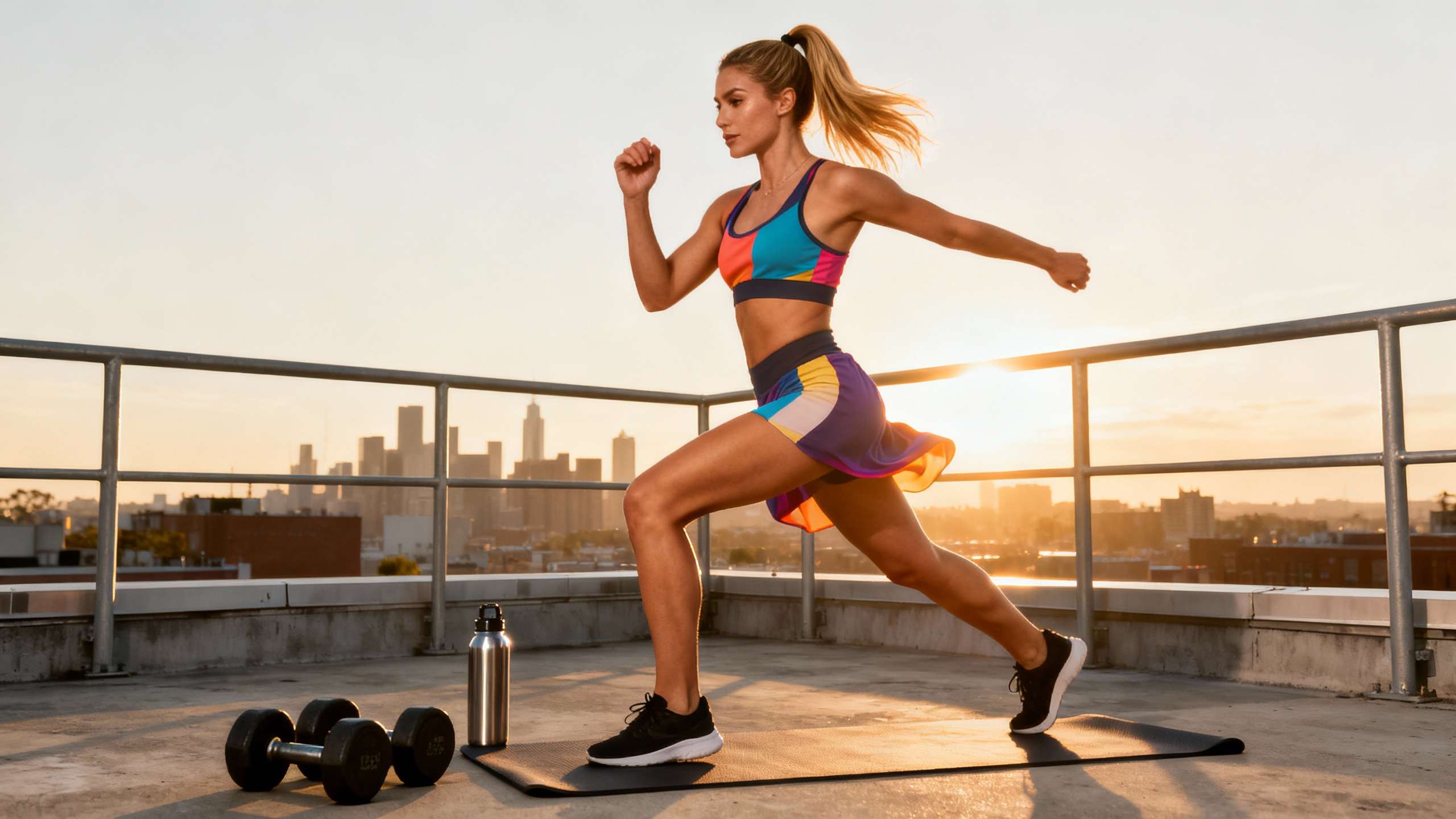
Table of Contents
- What Color Blocking Really Means In Performance Gear
- The Color Science Under The Blocks
- How Color Blocks Shape Perception And Body Lines
- The Style Payoff: Identity, Confidence, And Everyday Wearability
- The Functional Edge: Performance, Psychology, And Safety
- Visibility, Recognition, And Communication
- Color Psychology And Game-Day Mindset
- Body Mapping, Heat, And Comfort
- Durability, Printing, And Sustainability
- How To Design Color‑Blocked Sportswear That Works Hard
- Start With Performance Goals And Identity
- Choose A Compact, Intentional Palette
- Place Colors Where They Actually Work
- Factor In Climate, Terrain, And Lighting
- Prototype, Test, And Iterate
- Pros And Cons Of Color Blocking In Sportswear
- Short FAQ
- Does color blocking actually improve performance or just style?
- How many colors should I use in a high‑performance color‑blocked kit?
- Is monochrome color blocking boring compared with high‑contrast looks?
- References
As someone who spends half the week tuning high‑performance gear and the other half chasing dirt, asphalt, and singletrack on a Kawasaki, I’ll tell you this up front: the colors on your kit are not just for the gram. Thoughtful color blocking can sharpen visibility on a foggy ridge, shift your mindset on race day, and still look sharp when you roll straight from the trail to the coffee stop.
Color blocking sits at the intersection of color science, sports psychology, and real-world performance design. Used well, it becomes a tool that balances style and function instead of forcing you to choose one or the other.
In this deep dive, we will unpack what color blocking really is, how the underlying color theory and sports psychology work, and how to design color‑blocked sportswear that looks fast and performs even faster.
What Color Blocking Really Means In Performance Gear
In design terms, color blocking is the practice of building garments from large, solid areas of color, usually separated by clean, geometric lines. Think of bold rectangles, angular bands, or diagonal panels of red, blue, and black on a jersey, without gradients, prints, or fussy textures getting in the way. Sources on design history trace this idea back to early‑20th‑century movements like De Stijl and the Bauhaus and to artists such as Piet Mondrian and Josef Albers, who explored how pure color fields interact.
Fashion pulled that language straight onto the runway. In the 1960s, designers translated Mondrian’s primary‑colored grids into dresses, and color blocking resurfaced in the disco era through Stephen Burrows’ fluid, multi‑color jersey pieces. Since then, it has cycled through 1980s neons, 2010s streetwear, and today’s athleisure and team uniforms.
In sportswear, color blocking refers to the same idea but applied to jerseys, tights, sports bras, tracksuits, and outerwear. Color block tracksuits pair two or three strong colors in big panels. Color block sports bras use asymmetrical panels of bold shades over technical fabrics. Color‑blocked team uniforms build high‑contrast zones to frame logos, numbers, and sponsor marks so they pop from the stands or on broadcast.
There is also a softer side: monochrome and tonal color blocking. You might see an all‑navy running kit that uses slightly different tints and shades of navy across top, bottom, and accessories. It still counts as color blocking because the outfit is built from distinct blocks of a single color family rather than prints or micro‑patterns.

The Color Science Under The Blocks
To understand why color blocking works so hard for both style and performance, you need a little color theory. Fashion and sportswear designers lean on the same fundamentals described by color‑theory guides from design schools and apparel manufacturers.
At the base is the color wheel with primary, secondary, and tertiary hues. Traditional art uses red, yellow, and blue as primaries, while digital and printing systems use related concepts such as RGB and CMYK. From there, hues are modified by saturation and value. Saturation describes how intense or muted a color appears, and value describes how light or dark it is. Add white and you get a tint, such as turning red into pink. Add black and you get a shade, such as burgundy. Add gray and you get a tone, a more muted version of the original hue.
Color schemes then describe how hues are combined. Monochromatic schemes stay within one color and its tints and shades, creating a sleek, low‑contrast look. Analogous schemes combine neighboring hues, like red, red‑orange, and orange, for smooth harmony. Complementary schemes pair opposites, such as blue and orange, to create punchy, high‑contrast combinations. Triadic and tetradic schemes juggle three or four evenly spaced hues around the wheel, producing rich, energetic palettes that require more discipline to control.
Color blocking is essentially a way to deploy these schemes at full scale on the human body. Instead of a tiny printed stripe of yellow against navy, a color‑blocked jacket might devote the entire upper chest to yellow, the sleeves to navy, and the lower body to black. Because large flat areas of color are so visible, designers typically restrict themselves to a compact palette. Several apparel sources recommend sticking to two or three main colors for an outfit and treating black, white, and neutrals as supporting players. This keeps the look intentional rather than chaotic.
How Color Blocks Shape Perception And Body Lines
Color blocking is not just about which colors you pick. It is about where you place them. Researchers studying perception note that warm colors such as red and orange tend to visually advance, while cool colors such as blue and green recede. That means a red block on the chest or shoulders pushes those areas forward, while deep blue side panels can visually narrow and elongate the torso.
Fashion advice columns on color blocking for different body shapes leverage this effect. If you want to emphasize upper‑body power, placing brighter or warmer colors on the shoulders and chest and using darker or more neutral tones around the midsection can draw the eye where you are strongest. If you want your legs to read lighter and faster, using bolder color below the waist with darker bands at the hip can shift perception. For more rectangular frames, a brighter core with darker side panels or a contrasting belt can create the impression of stronger curves without sacrificing comfort or performance.
In performance apparel, technical designers use the same logic but tie it to function. High‑contrast waistbands, shoulder yokes, and side panels can subtly reshape how the body reads in motion. That does not change your physiology, but it can affect how you feel in the gear and how confident you appear to others.
The Style Payoff: Identity, Confidence, And Everyday Wearability
On the style side, color blocking is a workhorse. Bold blocks of color make uniforms and training kits instantly recognizable. Sportswear brands and team‑kit specialists highlight how contrasting panels frame logos and numbers so officials, teammates, and fans can identify players quickly. Iconic team palettes, such as purple and gold or bright orange and blue, rely heavily on color blocking to keep their visual identity crisp at distance.
Modern color‑block tracksuits show how far the idea has traveled. Articles describing current tracksuit trends talk about retro‑inspired two‑tone or three‑tone sets that move easily from gym to street. A red and navy set with a clear horizontal divide across the chest, or a yellow and black suit with a color‑blocked turtleneck and contrasting legs, looks intentional and confident without requiring extra styling. The advice is usually to let the suit be the star and keep the rest of the outfit minimal.
Color‑block sports bras bring the same logic into performance training. With asymmetrical high‑contrast panels across the chest and back, they create a sense of motion and dynamism even when you are standing still. Combined with supportive, moisture‑wicking fabrics, these pieces bridge fashion and function for everything from sprint sessions to yoga.
A major advantage of color blocking is inclusivity. Style writers who focus on this trend emphasize that almost any body can benefit from it. The key is choosing where to place brightness and where to use deeper, more neutral tones. You can highlight features you love with bold colors and let supporting colors quietly handle areas you are less keen to spotlight. At the same time, most of these sources stress flexibility. The goal is to feel powerful and authentic, not to follow rigid shape rules.
There are trade‑offs. Color blocking is visually strong, so it can become overwhelming if you throw too many saturated hues into one outfit. That is why many designers recommend staying within a three‑color rule for the main garment and keeping additional colors in small accessories. Neutrals such as black, gray, cream, and navy can act as buffer zones that make bold blocks more wearable. Trend cycles can also move quickly; a high‑saturation, multi‑color set that feels cutting‑edge this season can look dated in a couple of years, whereas monochrome or analogous schemes age more slowly.
For riders and athletes living an athletic lifestyle, the upside is big. When you step off the bike or board, a well‑blocked jacket or tracksuit reads as deliberate streetwear rather than “still in training clothes.” That makes color blocking a practical way to carry your performance identity into daily life.

The Functional Edge: Performance, Psychology, And Safety
When we shift from style to function, color blocking becomes even more interesting. The same large panels that make your gear look sharp can influence visibility, mindset, and even how heat and sweat are managed.
Visibility, Recognition, And Communication
In fast, chaotic environments, you want teammates, marshals, and traffic to pick you out instantly. Bold color blocking is a simple way to create that clarity. Team‑uniform specialists point out that high‑contrast blocks around numbers and logos dramatically improve legibility on the field or court. Players in color‑blocked kits are easier to track not only for fans but also for referees and opponents, which can reduce confusion during quick plays.
For outdoor and adventure sports, this translates directly to safety. A bright yellow or orange block across the chest or shoulders can make a runner or rider easier to spot against trees or rock when light is flat. Color blocking also allows you to reserve ultra‑vivid panels for high‑movement zones such as arms and lower legs, where motion naturally draws attention, while using darker or more subdued colors over the core for a sleeker look. Designers combining high‑visibility neons with reflective elements take this even further, ensuring athletes stand out in low‑light conditions.
Because color‑blocked garments rely on a limited palette, they can keep visibility high without looking like safety vests. A navy and black jacket with a single, well‑placed lime or yellow block can be enough to catch headlights or a teammate’s eye, especially when the layout respects the geometry of movement.
Color Psychology And Game-Day Mindset
Color psychology in sportswear looks at how colors influence emotion, arousal, and perception. Multiple sportswear and team‑sports studies frame color choice as a low‑cost psychological tool, not just a branding decision.
Research summarized in outlets such as the Proceedings of the Royal Society B and various sports‑psychology reviews has repeatedly found associations between red and dominance in combat sports. In a well‑known analysis of Olympic combat events, athletes randomly assigned red gear won a higher percentage of matches overall, with the effect especially pronounced in close contests. Other research and industry briefs report similar patterns in soccer and other sports, along with observational notes that teams in red are often perceived as more aggressive and powerful.
At the same time, a recent meta‑analysis covering dozens of color‑performance studies, highlighted by fitness writers, concludes that the direct impact of color on raw physical output is small. Where color clearly matters is in emotional regulation and perception. In other words, the color of your kit will not magically add power to your legs, but it can nudge your arousal level, confidence, and how opponents and spectators see you.
Design and sportswear experts converge on a few consistent associations. Red is tied to aggression, intensity, and competitiveness and can raise perceived dominance and physiological arousal. Blue communicates calmness, trust, and composure and suits precision or endurance‑oriented sports. Green evokes balance, harmony, and a connection to nature and is often recommended for outdoor or focus‑heavy activities. Yellow and orange are linked to optimism, energy, and high visibility, boosting morale and helping with quick recognition. Black signals authority, power, and sophistication and can feel intimidating in competition, though it absorbs more heat under sun. Purple and lavender are increasingly used for recovery or lower‑intensity contexts because they are associated with relaxation and reduced perceived fatigue.
Color blocking lets you deploy those psychological levers surgically. You might use a deep red block across the chest of a race jersey to cue dominance, framed by cooler blue or green fields that keep the overall mood composed. A trail set could use bright yellow micro‑blocks at cuffs and collar to inject energy and visibility while keeping the body in grounding forest tones. Recovery gear might flip the script, using lavender and soft neutrals in broader fields to encourage the nervous system to settle.
Here is a concise snapshot of commonly cited signals and how they translate into color‑blocked sportswear design.
|
Color family |
Common signal in sport psychology sources |
Use in color‑blocked sportswear |
Key considerations |
|---|---|---|---|
|
Red |
Dominance, aggression, intensity, higher arousal |
Chest panels, sleeve tips, or accent blocks for game‑day kits and high‑intensity training |
Can increase agitation if overused; consider balance with cooler tones and manage heat in sunny conditions |
|
Blue |
Calmness, focus, trust, composure |
Large base fields in jerseys, tights, and jackets; ideal for endurance or precision sports |
Too much dark blue without contrast can look flat; add lighter tints or a bright accent |
|
Yellow |
Optimism, confidence, energy, high visibility |
Accent blocks around numbers, shoulders, and calves to boost morale and visibility |
Extremely bright yellows can feel harsh; useful in small but strategic blocks |
|
Green |
Balance, harmony, nature, mental clarity |
Base or secondary fields for outdoor and field sports; grounding color for trail and adventure kits |
Saturation matters; very bright greens can clash with certain landscapes or lighting |
|
Black |
Power, authority, intimidation, sophistication |
Slimming side panels, shorts, and detailing around logos for a sharp, strong look |
Absorbs heat and can tire athletes faster in hot sun; balance with lighter blocks |
|
Orange |
Energy, enthusiasm, determination |
Dynamic sleeve or side blocks in team and training gear |
Best used where you want attention; like red and yellow, can feel overwhelming at full coverage |
|
Purple / Lavender |
Recovery, relaxation, introspection, creativity |
Recovery tops, lifestyle hoodies, or subtle panels in less intense sessions |
Primarily psychological; tends to work better in off‑field or lower‑intensity contexts |
|
Neutrals (white, gray, navy, beige) |
Clean contrast, sophistication, stability |
Large base fields, buffer zones between bright blocks, or monochrome kits |
White shows stains; grays can look muted under certain lights; extremely dark neutrals carry similar heat issues to black |
As a performance specialist, I treat these associations as tuning knobs rather than hard rules. On days when I want a rider more aggressive and switched on, I will lean on warm color blocks. When an endurance event demands steady focus for hours, I prefer cooler bases with just enough warm accent to keep energy high.
Body Mapping, Heat, And Comfort
Color blocking does more than manipulate perception. It can support the way technical fabrics manage heat, sweat, and muscle support.
Sports apparel design firms emphasize “body mapping,” where different knit structures or fabric weights are placed in specific zones for ventilation, stretch, or support. PUMA’s body‑mapped designs, for example, use targeted patterns to deliver more breathability in hot zones and extra stability where athletes need it most. Color blocks are often aligned with those functional panels so the visual map reflects the performance map.
Functional considerations from team‑apparel and textile manufacturers add another layer. Dark colors absorb more heat, which can fatigue players in direct sun, while light tones keep athletes cooler but show stains and sweat more readily. Matte fabrics show color blocks clearly and avoid glare under stadium or headlamps, whereas shiny fabrics can shift how colors appear and may highlight perspiration.
Color blocking lets you put darker, more heat‑absorbing shades where you want compression, durability, or stain‑masking, and lighter tints where cooling is critical. For example, deep charcoal along the seat and inner leg of riding pants can hide dirt and abrasion, while lighter greens or blues on thighs and lower back keep the garment visually fresh and cooler in temperature. Textile companies also note that darker shades can better mask irregularities in recycled fibers, which supports sustainable material use without sacrificing aesthetics.
Durability, Printing, And Sustainability
The way colors are applied matters as much as which colors you choose. In bold, multi‑color sports uniforms, dye‑sublimation printing is often the go‑to method. It fuses dye into polyester fibers, creating vivid, long‑lasting color blocks that do not crack or peel under stretching and washing. Industry estimates describe sublimation as a multi‑billion‑dollar global market because it handles complex color blocking so well.
Other methods, such as Direct‑to‑Film printing and traditional screen printing, can also produce color‑blocked designs, especially on cotton and blends, but each brings trade‑offs in hand feel, breathability, and long‑term vibrancy. Screen printing works best for simpler, limited‑color layouts and can feel heavier on the body.
On the sustainability side, textile suppliers report progress with closed‑loop dyeing systems that reuse the vast majority of process water, as well as foam‑based dye techniques that significantly cut waste. Some explicitly mention reusing around 98 percent of water and cutting waste roughly in half with certain processes. Those gains matter when you are laying down large swaths of color across performance fabrics. There is also a cost angle: custom dyes, intricate gradients, and one‑off shades lengthen lead times, while using stock colors and well‑known Pantone references can shorten production schedules by roughly a third. Color blocking, with its preference for pure, flat hues, can take advantage of those efficiencies if you plan the palette well.

How To Design Color‑Blocked Sportswear That Works Hard
So how do you pull all of this together into gear that looks good in photos, feels right when you put it on, and supports how you perform, whether that is on a Kawasaki at 60 mph or on foot at mile 20 of a trail run?
Start With Performance Goals And Identity
Before picking colors, clarify what you need the gear to do. Team‑color theory guides consistently recommend aligning color choices with the story you want to tell. If your playing style or riding group leans on aggression, high tempo, and fearless overtakes, stronger doses of red, yellow, and orange will match that energy. If your strength is control, strategy, and late‑race composure, building around blue and green with only small warm accents can reinforce that identity.
For individual athletes, sportswear psychology pieces suggest matching color choices to session goals. High‑intensity intervals or heavy lifting might justify higher‑arousal colors in key blocks. Long, technical rides where focus and breathing matter more could lean into blues and greens instead. When I prep a mixed‑terrain day, I will often reserve the boldest blocks for the piece I associate with “go mode,” such as a jersey or shell, and keep base layers calmer.
Choose A Compact, Intentional Palette
Once the goal is clear, pick a palette that is focused rather than crowded. Fashion and sportswear experts repeatedly recommend limiting outfits to two or three main colors, treating white, black, and gray as neutrals you can add without fully counting against that limit. This prevents visual noise and keeps color blocking from turning into distraction.
Monochrome color blocking, where you use one hue and vary its depth, is the easiest entry point. A deep green tight paired with a slightly lighter green top and an even lighter accent on the zipper or cuffs looks refined but still uses block logic. Analogous schemes, such as blue, teal, and green, bring a bit more interest without harsh contrast. Complementary schemes like blue and orange or purple and yellow create high energy and are common in bold team kits, but they require careful balancing so one color clearly leads while the other supports.
Neutrals are the stabilizers. A black and charcoal base with a single lime or red block is often more powerful than three equally bright shades fighting for attention. Several color‑blocking guides point out that neutrals in shoes, helmets, and jackets can make even daring combinations easy to wear.
Place Colors Where They Actually Work
With your palette in place, the next question is layout. Here, the visual tricks we discussed earlier become practical design levers.
If you want to emphasize upper‑body authority, put your strongest color block across the shoulders and chest and let the torso taper into darker or more muted tones. To make legs look fast and dynamic, place bright color down the outer thigh or calf where movement is most visible. If you prefer a leaner look, consider dark side panels that visually trim the silhouette while brighter front panels carry team colors or brand identity.
Style pieces on color blocking for diverse body types highlight another tactic: use a darker or neutral band at the waist or midsection to avoid cutting the body in half visually. Instead of a hard, high‑contrast stripe around your midriff, consider letting color change along vertical or diagonal seams that follow muscle lines. From a performance perspective, this not only looks better in motion but also aligns more naturally with how garments are patterned and how fabrics stretch.
For adventure and backcountry scenarios, think about where your riding partners or safety teams view you from. High‑contrast blocks along the upper back, shoulders, and helmet line are easier to spot in mirrors and in the periphery than low‑contrast, all‑dark kits. Color blocking gives you that safety margin without forcing day‑glow coverage over every square inch.
Factor In Climate, Terrain, And Lighting
Functional color theory for team apparel reminds us that climate and lighting conditions should influence color choices. Dark‑dominated color‑blocked gear in direct summer sun can shorten time to fatigue because of heat absorption, particularly in high‑output sports. In that context, lighter bases with dark reinforcements only where needed make more sense. Conversely, in cooler climates, strategically placed darker panels can help you feel warmer and hide mud or spray.
Lighting also shifts how colors read. Textile and fashion‑design guidance stresses testing swatches under both natural and artificial light. Dyes such as indigo can shift noticeably under LEDs. In a stadium, broadcast or arena lighting can flatten subtle tonal differences, making small blocks disappear. That is why many teams test kits under actual game lights before finalizing. For night rides or runs, neons and reflective elements are especially important, and color blocking can reserve those brightest colors for the zones that interact with headlights and streetlights most.
Terrain is another subtle factor. In dense forest, deep green and brown‑based gear can blend into the background, so adding non‑natural accent blocks becomes crucial. In desert or high‑alpine environments, slightly cooler blues and greens can stand out cleanly against warm rock and dust tones, while still feeling balanced with the landscape.
Prototype, Test, And Iterate
Finally, treat your color‑blocked design the way you treat your training: as an iterative process. Several uniform and sportswear companies recommend using design tools and physical samples to trial color combinations before locking in production. They also stress gathering feedback from players and fans on how colors make them feel and how they read at distance.
On a practical level, that means trying your gear in real sessions. Take your color‑blocked kit through sweat, dust, and light changes. Notice how it affects your mood when you put it on, how visible you feel to others, and whether any blocks emphasize areas in ways you do not love. Cameras are honest; check photos and video as well, since sport is increasingly lived on screen. Adjust color placements and saturation levels as needed, then retest.

Pros And Cons Of Color Blocking In Sportswear
Color blocking is powerful precisely because it sits between style and performance. Like any powerful tool, it brings advantages and trade‑offs.
On the plus side, it delivers instant visual identity, sharpens visibility, and makes logos and numbers legible without clutter. It is inclusive, offering ways to celebrate different body types through thoughtful placement of light and dark zones. It allows you to integrate color psychology into your kit so that your clothing supports your game plan, whether that means more aggression, more calm, or more joy. And when paired with smart material choices and sustainable dyeing practices, it can be both durable and environmentally responsible.
On the downside, color blocking can become overwhelming or gimmicky if you chase too many trends or stack too many saturated hues together. Poorly placed blocks can chop the body in unflattering ways or distract from movement lines. Dark, heat‑absorbing fields can work against performance in hot climates, and ultra‑bright palettes can create visual fatigue for both wearers and spectators. Production‑wise, complex multi‑color layouts and custom dyes increase costs and timelines compared with simpler, stock‑color designs.
Crucially, research suggests that color alone provides only marginal direct performance gains. The real value lies in how it shapes feeling, focus, and perception at the margins where elite performance is decided.
Short FAQ
Does color blocking actually improve performance or just style?
Evidence from sports psychology indicates that color can influence emotions, arousal, and perceived dominance, especially in contexts such as combat sports where red has shown a statistical advantage in close matches. However, a large meta‑analysis of color‑performance studies suggests that the direct impact on physical output is modest. Color blocking improves performance indirectly: it supports better visibility, clearer communication, and a mindset that matches your goal, all while giving you a cohesive identity that can increase confidence.
How many colors should I use in a high‑performance color‑blocked kit?
Most fashion and sportswear guidance recommends limiting yourself to two or three main colors per outfit, with black, white, and other neutrals acting as flexible additions. This keeps the design readable and avoids visual overload. In practice, that might mean a deep blue base, a bold red block on the chest, and a smaller yellow accent on cuffs or numbering, with black used for trims and logos.
Is monochrome color blocking boring compared with high‑contrast looks?
Not at all. Monochromatic schemes, where you build an outfit from different tints and shades of one hue, are frequently described as polished, modern, and easy to wear. A charcoal, gray, and off‑black combination can look as sharp and technical as any multi‑color kit while being more versatile across seasons and settings. You can always introduce small contrasting accents in accessories if you want a little extra edge.
When I set up a rider or runner with a new kit, color blocking is never an afterthought. It is part of the performance system, right alongside fabric selection, fit, and protective features. Build your blocks with intent, let your colors carry your story, and then take them out into the real world—onto the trail, track, or highway—and let the ride prove what works.

References
- https://www.samford.edu/sports-analytics/fans/2017/Wear-Red-and-Youll-Win-Gold
- https://www.teamspiritsports.com.au/blog/psychology-of-colours-in-sports
- https://www.jdinstitute.edu.in/in-living-color-the-role-of-color-theory-in-fashion-design/
- https://www.fittdesign.com/blog/the-art-of-color-and-pattern-in-sportswear-design
- https://grokipedia.com/page/Color-blocking
- https://www.gymclothes.com/upgrade-your-fashion-game-with-color-block-tracksuits/
- https://www.leftyproductionco.com/post/4-color-blocking-rules-to-follow
- https://morningstartshirts.com/the-basics-of-color-theory-for-sports-team-apparel/
- https://www.owayo.com/magazine/psychology-of-colors-in-team-sportswear-us.htm
- https://www.printful.com/blog/color-psychology-in-ecommerce-and-branding
RELATED ARTICLES



Ready to start your sportswear brand?
Get a free quote for custom sportswear manufacturing with no minimum order quantity.