
How to Use Color Blocking to Enhance Your Body Shape in High‑Performance Gear


Table of Contents
- What Color Blocking Really Is (And Why Athletes Should Care)
- The Color Science Behind the Blocks
- How Color Blocks Reshape the Body
- Color Blocking for Different Body Shapes in Performance Gear
- Powerful Upper Bodies: Inverted Triangle and Swimmer Shoulders
- Strong Lower Bodies: Pear Shapes, Cyclist and Runner Legs
- Core Focused: Apple Shapes and Strong Midsections
- Straight Frames: Rectangle Bodies Looking for Curves
- Naturally Curvy: Hourglass Bodies That Need Control, Not Hiding
- Quick Reference: Body Shape and Color-Block Strategy
- Adventure-Ready Color Blocking: From Street to Singletrack
- Common Color-Blocking Mistakes in Sports and Adventure Gear
- A Practical Strategy to Build Your Color-Blocked Performance Wardrobe
- FAQ: Color Blocking and Body Shape in Performance Gear
- Is color blocking only flattering on lean or model-like bodies?
- Can I color block if I prefer mostly black gear?
- Do these principles change between summer and winter gear?
- References
When you’re bombing down a trail at 30 mph, carving up a canyon road, or sprinting the last 50 yards to the finish line, your gear does more than protect you. It broadcasts who you are. As someone who lives in color-blocked race jerseys, armored jackets, and trail packs, I’ve seen firsthand how the right color placement can make a body look stronger, leaner, and more balanced while still screaming performance.
Color blocking is not just a fashion trend. Used intelligently, it is a precision tool to sculpt how your body reads in motion. In this guide, I will break down how to use color blocking based on solid color theory, credible design resources, and practical, sweat-tested experience in high-performance sports and adventure apparel.
What Color Blocking Really Is (And Why Athletes Should Care)
Color blocking means combining large, solid panels of distinct colors in one look. Think of a jacket with a black torso and electric-green sleeves, leggings with dark side panels and a bright front, or a moto jersey with bold color bands across chest and shoulders. As brands like Birdies, Interweave, and InStyle point out, the classic approach uses clear blocks of color rather than prints or gradients, often with noticeable contrast.
Historically, the look is linked to Piet Mondrian’s geometric paintings and exploded in fashion in the 1960s with Yves Saint Laurent’s famous Mondrian dresses. Pretty & All highlights how Black designer Stephen Burrows pushed color blocking into a long-lived trend from disco dance floors to modern icons, and it has cycled back through the runways in the 1980s, early 2010s, and again in the 2020s. High Latitude Style notes that versions of it keep reappearing because the formula is simple, graphic, and endlessly remixable.
For performance and adventure gear, color blocking matters for three reasons. First, it changes how your proportions are perceived; darker panels can slim while bright ones emphasize muscle. Second, it drives visibility and safety; strategic high-impact color at shoulders, chest, or helmet level makes you more noticeable on the road or trail. Third, it communicates energy and identity; a color-blocked riding kit looks faster and more assertive than a flat, solid color from head to toe.

The Color Science Behind the Blocks
Before you start playing with your jacket, pants, helmet, and pack, you need a little color theory. The basics come up again and again in fashion and design resources from High Latitude Style, Birdies, the Museum at FIT, and Rocky Mountain College of Art and Design.
The color wheel is your map. Colors opposite each other, like blue with orange or yellow with purple, are complementary. They clash in a controlled way and create high-impact color-blocked looks. Colors next to each other, such as red, orange, and pink, are analogous. They feel more blended and sophisticated, especially when you stay in a similar saturation range. High Latitude Style and Birdies both note that a hybrid approach, called an accented analogous scheme, starts with a cluster of neighboring hues and introduces one opposite color as a sharp accent.
High Latitude Style also explains triadic schemes, where three hues form an even triangle on the wheel, like green, orange, and purple. These combinations feel energetic but balanced when you keep the number of colors in the outfit to roughly three, which Howstuffworks-style guidance and Saks fashion editorials also support in general.
Color psychology adds another layer. Rocky Mountain College of Art and Design shows that reds push excitement and intensity, blues signal stability and professionalism, yellows radiate optimism but can feel edgy if overused, and greens relate to nature, energy, and health. Warm colors like red, orange, and yellow feel closer and more intense; cool colors like blue and green feel calmer and more distant. When I put a rider in warm, bright shoulder panels and a cooler, darker torso, they look more powerful and approachable at the same time, and the eye naturally lands where the color heat is strongest.
Fit and texture matter too. The Museum at FIT emphasizes that color is only one design element alongside line, shape, and texture. Vertical lines elongate; horizontal blocks widen; diagonal cuts add movement. Smooth, matte fabrics keep color blocks crisp, while shiny textures and big prints can visually enlarge an area. Thestyletti, drawing on personal experience, reinforces that light, pale, or metallic colors advance and make an area look bigger, while dark colors recede and slim.
Finally, personal color analysis matters for which hues you choose, even inside the same blocking layout. IED’s color-analysis guidance describes how seasonal palettes (Spring, Summer, Autumn, Winter) are built from temperature and value. Warm, bright “spring” riders usually look sharper in clear, fresh colors; cool, deep “winter” riders can handle icy whites and saturated jewel tones. Once you know your general palette, you can pick your bright and dark blocks from hues that actually flatter your skin, eyes, and hair instead of fighting them.
How Color Blocks Reshape the Body
Color blocking works on the body like contouring and strobing works on the face. The Concept Wardrobe, Interweave, Dhgate’s style guides, and Thestyletti all describe the same core principle: dark and matte recede; light and bright highlight; contrast draws a line where the colors meet.
If you run a dark panel down the outer sides of your leggings and keep the front a bit lighter, your legs look slimmer and longer. If you drop a bold band around the waist of a training top, you emphasize the waistline; move that band higher or lower and you visually shift where the waist appears.
Shape and direction of blocks matter. Interweave explains that straight horizontal blocks can make you look boxy if they land at the widest part of the body, especially around the stomach or hips. Vertical or slightly diagonal blocks guide the eye up and down instead of side to side, which is why apple-shaped torsos look better with vertical or slanted panels rather than a high-contrast band exactly across the midsection. Dhgate-style body-contouring advice notes that curved blocks and diagonal lines can “carve” softer curves into the silhouette, much like how zebra stripes diffuse the outline of a moving animal.
In sports gear, you can use these illusions aggressively. I have seen bulky armored jackets suddenly look streamlined on an athlete once we shift from a solid bright front to a dark torso with bright shoulders and sleeve heads. The protection did not change; the perception of width did.

Color Blocking for Different Body Shapes in Performance Gear
Pretty & All calls color blocking a rare trend that truly suits every body type, as long as you place the colors strategically. Interweave and Dhgate both provide shape-based strategies that adapt beautifully to high-performance apparel.
Powerful Upper Bodies: Inverted Triangle and Swimmer Shoulders
If your shoulders and chest are broader than your hips, you are in the inverted triangle zone, common among swimmers, paddlers, and heavy lifters. Interweave suggests putting darker or more neutral colors on top and brighter ones on the lower body. That advice translates directly into performance gear.
When you choose a riding shell with a black or deep navy yoke and torso and reserve the bold color for the pants, gloves, or shoes, your proportions look more balanced. You can also add subtle vertical or V-shaped seams in contrast stitching rather than big horizontal chest stripes. In training tops or trail jerseys, aim for darker shoulder panels with a brighter block from lower ribs down, or a bold side stripe on the pants instead of a loud upper body. That keeps the power of your shoulders without letting them visually dominate.
Strong Lower Bodies: Pear Shapes, Cyclist and Runner Legs
Pear-shaped bodies carry more volume at the hips and thighs, a common pattern for cyclists, sprinters, and trail runners. Pretty & All and Interweave agree on the core tactic: keep bottoms darker and draw attention upward with brighter color blocking.
In the gym, that might mean charcoal compression tights with a bright color-blocked sports bra and a mid-tone tank or jacket layered on top. On the trail, choose hiking pants with dark, matte fabric over hips and thighs and add color in the upper pockets, shoulder yoke of the jacket, backpack straps, and helmet. If you do want bright lower pieces, look for designs that include vertical or diagonal dark panels over the fullest part of the thighs rather than solid neon from waistband to hem.
Core Focused: Apple Shapes and Strong Midsections
Apple-shaped bodies carry weight through the midsection, with slimmer legs and often great shoulders. Interweave and Pretty & All both recommend placing bright colors at top and bottom and using darker blocks through the center. Dhgate adds that vertical or diagonal torso blocks are ideal.
In a performance context, imagine a color-blocked jacket that has a dark, slightly curved panel sweeping from under the bust through the waist and down the center front, framed by brighter shoulders and hem. You can echo that in leggings by using darker mid-rise waistbands and brighter calves or shoes. Trail running tops with darker side panels that narrow at the waist and lighter fronts and backs create an instant visual cut-in without sacrificing tech performance.
The key is to avoid a single high-contrast horizontal band right across the fullest part of your belly. If you love chest stripes, keep them higher near the shoulders or lower at the hip line, where they emphasize strength rather than width.
Straight Frames: Rectangle Bodies Looking for Curves
Rectangle bodies have shoulders, waist, and hips in similar width. Dhgate notes that you can simulate curves by widening bust and hips while visually cinching the waist. Interweave suggests belts, narrow mid-panels, and strategic color placement.
In training sets, pick a top with bright shoulders, a darker midsection block, and then a brighter hem panel. Pair it with leggings that repeat the pattern: bright upper thighs, slightly darker mid-thigh or knee area, and a bright band at the calf. This interplay makes your shoulders and hips read broader than your waist, creating the illusion of an athletic hourglass.
You can also lean on monochrome color blocking. High Latitude Style and Pretty & All highlight how different tints of a single color are trending. For a rectangle frame, try deep teal at the waist, medium teal at bust and hips, and a pale teal accent at shoulders and hem. The eye registers the value changes as curves without needing loud contrasts.
Naturally Curvy: Hourglass Bodies That Need Control, Not Hiding
Hourglass shapes already have balanced shoulders and hips with a clear waist. Pretty & All suggests using one color on top and another on the bottom to emphasize curves and warns against chopping the body into equal halves. Interweave echoes this and advises highlighting the waist rather than slicing it.
In high-performance gear, you can lean into clean top-to-bottom color splits: a predominantly dark packable jacket over bright leggings, or a bright top over more grounded pants, provided the line where they meet hits either slightly above or below the narrowest part of your waist. To show off that curve, look for jackets and jerseys with slightly darker side panels and a lighter panel that narrows at the waist, or use a bold belt or waist-strap detail in your pack harness or hydration vest.
The one trap for hourglass riders and runners is an outfit where a thick, high-contrast band lands exactly midway between shoulders and hem. That cut can flatten your natural curves into a blocky shape. Shift that high-impact band higher or lower and let the waist breathe visually.

Quick Reference: Body Shape and Color-Block Strategy
|
Body shape / athletic vibe |
Visual goal in gear |
Color-block placement strategy |
|---|---|---|
|
Inverted triangle |
Soften broad shoulders |
Darker tops, brighter lower pieces; vertical or V-lines |
|
Pear / powerful legs |
Balance hips and thighs |
Darker bottoms; bright tops, packs, and helmets |
|
Apple / strong core |
Streamline midsection |
Bright shoulders and hem; darker center and side panels |
|
Rectangle |
Create athletic curves |
Brighter bust and hips; darker waist blocks |
|
Hourglass |
Preserve balanced curves |
Emphasize waist with shaped blocks; avoid mid-body bands |
This table summarizes recommendations grounded in guidance from Interweave, Pretty & All, Dhgate’s fit-focused tips, and Thestyletti’s contouring insights.

Adventure-Ready Color Blocking: From Street to Singletrack
Once you understand the fundamentals, it is time to deploy them across your full adventure kit. Unlike office wear, performance gear stacks multiple layers and technical pieces, so you can build color-blocking in three dimensions.
On the bike, I like to anchor the torso of a jacket or jersey with a darker neutral so the armor and pockets do not add visual bulk. Then I put high-impact color at the shoulders and upper arms for visibility and power, plus a smaller bright block at the lower back for when the rider is in a tuck and only the backside is visible. Pants usually get darker hips with brighter knees and calves, which helps protect the shape of muscular legs rather than ballooning them.
For trail running and hiking, shell jackets with darker side panels and underarms and lighter, more saturated fronts and hoods keep the body looking streamlined while the head and shoulders remain easy to spot. Backpacks become part of the color-block system; a darker pack body with bright straps and hip belt activates the chest and waist without adding “back bulk” in photos or mirrors.
In the gym, the same principles apply in a simpler environment. Dark compression shorts with a bright side panel and matching bright top draw attention to speed and strength rather than width. Shoes and socks offer additional small color blocks; Thestyletti warns that dark shoes that contrast sharply with pale legs shorten the appearance of the leg, so for maximum length you can opt for sneakers closer to your skin tone or tight color to your leggings, then add your bold accent at the upper body.

Common Color-Blocking Mistakes in Sports and Adventure Gear
The nice thing about color blocking is that small corrections can change everything. Dhgate’s practical guide and Interweave’s knitwear-focused article both flag several recurring mistakes that I also see in performance gear closets.
The first issue is using too many colors. Everyday outfits rarely look cohesive with more than three strong hues, and this carries over to technical apparel. A bright jacket, bright pants, bright shoes, bright helmet, and bright pack may all be individually cool, but together they read chaotic. Instead, decide which piece will be the main color hero and let the others echo or support it in more muted or neutral tones.
The second mistake is ignoring saturation. InStyle’s stylists recommend matching brights with brights and pastels with pastels so the outfit looks intentional. A neon green top with a dusty, faded red bottom can feel mismatched, whereas a rich forest green with deep burgundy feels coordinated, as brands like Review Australia note in their seasonal pairing suggestions.
Third, block placement can accidentally widen the body. A solid bright band over the widest part of the hips or stomach, or leggings with a bright horizontal stripe across mid-thigh, will instantly broaden that area. When you catch yourself reaching for those designs, ask whether the stripe could be higher or lower or swapped for a vertical or diagonal version.
Fourth, fabric and fit can destroy a great color plan. Dhgate emphasizes that fabrics that wrinkle, sag, or stretch unpredictably distort block shapes. In performance gear, that means paying attention to how a jacket rides up when you are in a tuck or deep squat and whether leggings go sheer or twist at the knee. A vertical dark stripe that bends into an S because the fabric is too thin will no longer slim you; it will just look off.
A Practical Strategy to Build Your Color-Blocked Performance Wardrobe
Interweave suggests a four-level progression for getting comfortable with color blocking, and this approach works extremely well when you are assembling sports and adventure gear.
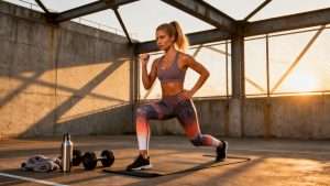
Start with level one by pairing a neutral base with a single high-impact color that flatters you. Neutrals include black, gray, dark brown, white, and navy. Pick one high-impact color drawn from your personal palette, as color-analysis experts at IED would recommend. Put that bold hue on the part of your body you want to highlight and keep the area you want to downplay in the neutral. For example, if you love your legs, go for bright running tights with a darker top; if you like your shoulders, choose a vivid jersey over dark shorts.
Move to level two by expanding your scheme either with shades and tints of the same color or with neighboring hues on the color wheel. You might combine a rich green jacket with lighter green accents and darker forest green tights, or you could build an analogous look like pink, red, and orange across sports bra, top, and shoes. High Latitude Style and Pretty & All both show how staying within a color family keeps things bold but cohesive.
Progress to level three by adding a single complementary accent to an analogous base. If you are already running pink, red, and orange, drop in a small green block on your pack or shoes. If your base is blue and teal, add a touch of orange in a belt or glove. Birdies and High Latitude Style describe this accented analogous formula as a sweet spot where outfits feel fashion-forward without looking wild.
Finally, when you are comfortable, push to level four and experiment with full complementary or triadic schemes. You might pair blue with orange, or build a triad like green, orange, and purple across jacket, tights, and accessories. At this point, you will have a better sense of which areas of your body benefit from bold emphasis and which prefer subtle support, so you can place the loudest hue where it does the most good.
Throughout this progression, remember the design principles from the Museum at FIT: balance, proportion, emphasis, and unity. Every color choice should answer a simple question: what part of my body or movement do I want people to notice first?

FAQ: Color Blocking and Body Shape in Performance Gear
Is color blocking only flattering on lean or model-like bodies?
Absolutely not. Pretty & All describes color blocking as a trend that can suit all body types, and Interweave as well as Dhgate show clear strategies for apple, pear, rectangle, inverted triangle, and hourglass shapes. The power of color blocking lies in tailoring block placement and contrast to your unique frame. On the trail and at the track, I have watched riders, runners, and lifters across sizes and shapes look more confident once their gear started working with their body instead of against it.
Can I color block if I prefer mostly black gear?
Yes, especially in performance contexts where black and dark neutrals are popular for practical reasons. You can treat black as your main neutral block and add a single bright color in strategic panels, following Interweave’s level-one approach. Black pants with a black-and-bright jacket, or a mostly black riding kit with one electric accent on gloves, shoes, or helmet, still counts as color blocking and can dramatically sharpen your proportions.
Do these principles change between summer and winter gear?
Seasonal color moods shift, but the underlying principles of light versus dark and vertical versus horizontal do not. Review Australia notes that bright, high-saturation pairings work beautifully in summer, while deeper, richer combinations like navy with burgundy shine in colder months. For winter riding or mountain trips, you may prefer deeper hues for warmth and practicality, but you can still position brighter panels at shoulders, hoods, and outer thighs for visibility and proportion control.
Color blocking in high-performance gear is not about decorating your body; it is about engineering how your power, agility, and shape are perceived on the move. When you combine proven color theory from sources like Interweave, Pretty & All, Dhgate, the Museum at FIT, and Rocky Mountain College of Art and Design with real-world testing on the trail and track, you get gear that does double duty: it works hard and looks fierce. Dial in your blocks, suit up, and let your colors carve the line before your tires, boots, or trail shoes do.
References
- https://www.academia.edu/92907856/The_selection_of_colors_for_fashion_collections_in_relation_to_color_theory
- https://scholarworks.calstate.edu/downloads/3484zq547
- https://www.ied.edu/news/armocromy-science-colours-personal-styling
- http://vision.soic.indiana.edu/papers/harmony2020cvprw.pdf
- https://ir.library.oregonstate.edu/downloads/6t053g25t
- https://guides.library.vcu.edu/color-theory/by-discipline
- https://www.fitnyc.edu/museum/documents/elements-and-principles-of-fashion-design.pdf
- https://www.rmcad.edu/blog/the-psychology-of-color-in-graphic-design/
- https://hecec.human.cornell.edu/2016/09/27/color-psychology-and-interview-apparel/
- https://ecommons.udayton.edu/context/graduate_theses/article/4934/viewcontent/r003655966.pdf

RELATED ARTICLES


Ready to start your sportswear brand?
Get a free quote for custom sportswear manufacturing with no minimum order quantity.