
Applying Abstract Art Patterns to High-End Customized Activewear

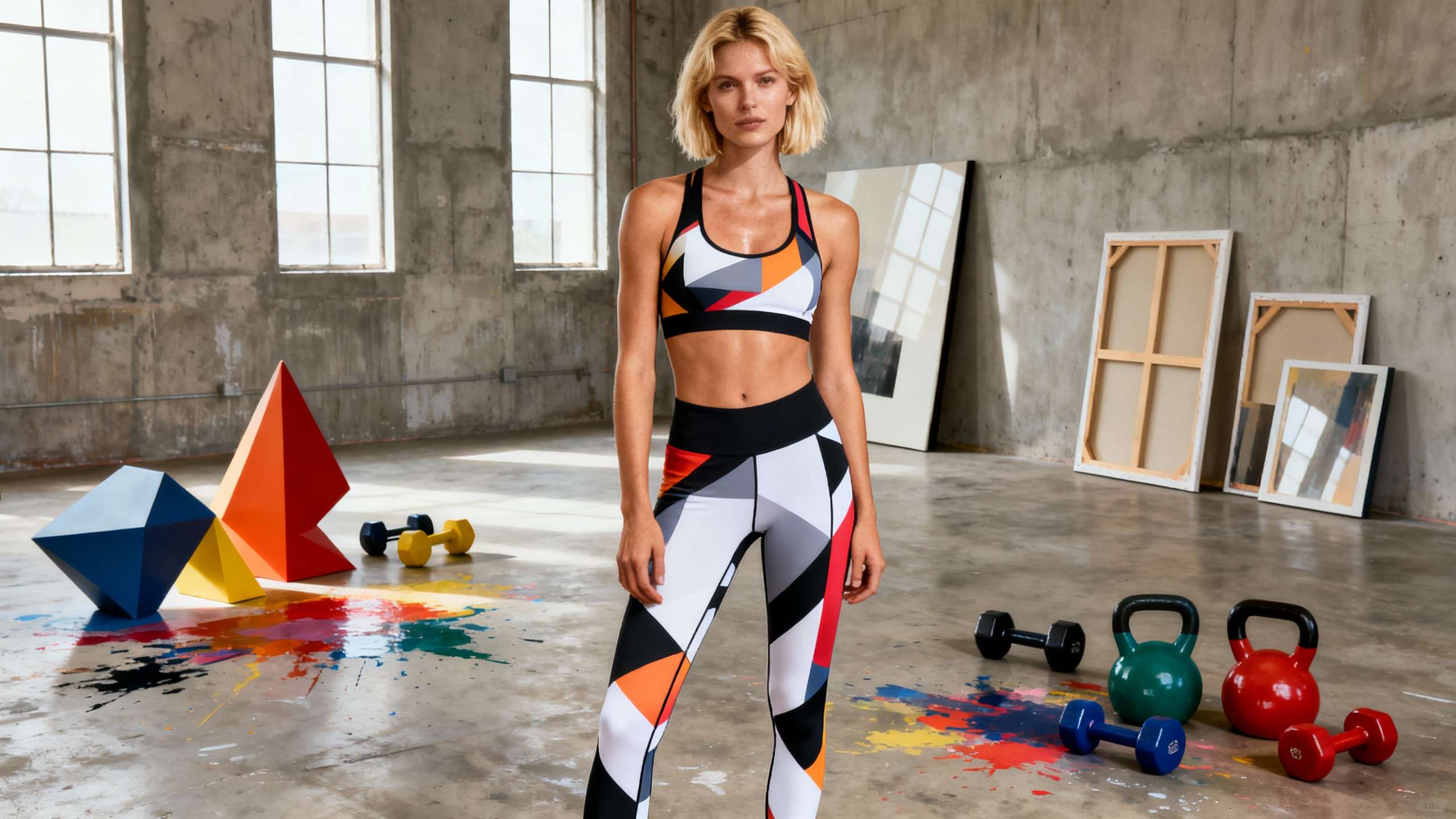
Table of Contents
- Why Abstract Art Belongs On Performance Gear
- What “Abstract” Really Means On Activewear
- Color Psychology And Performance
- Pattern Styles That Work On High-End Gear
- Designing Custom Abstract Activewear: A Practical Workflow
- Start With Story And Athlete Profile
- Build A Cohesive Abstract Language
- Engineer The Print Around The Body
- Balance Textures, Solids, And Prints
- Pros And Cons Of Abstract Art On High-End Activewear
- Making Sure The Art Does Not Kill Performance
- Material And Print Choices
- Care And Durability For Abstract Prints
- Adventure-Ready Style: Applying Abstract Art To Specific Gear
- Outdoor And Trail Gear
- Studio, Gym, And Street Athleisure
- Team And Club Kits
- How To Brief Your Designer Or Supplier
- Short FAQ On Abstract Art And High-End Activewear
- Closing Thoughts
- References
When you live at the redline—whether that is hammering a sprint on the track, threading a downhill line through wet roots, or pushing a long trail run in the heat—your gear has to do more than just look good. As a Kawasaki performance specialist who spends a lot of time testing high-output sports gear and adventure apparel, I have seen how the right activewear can flip an athlete’s mindset from “just get through it” to “let’s push harder.” Lately, one design direction keeps proving itself on the trail, in the gym, and in the paddock: abstract art patterns on customized, high-end activewear.
This is not about random splashes of color slapped onto cheap fabric. Done right, abstract art turns technical gear into wearable stories, without sacrificing stretch, breathability, or durability. Done wrong, it becomes noisy, dated, and fragile after a few washes. This guide walks through how to apply abstract art patterns to premium customized activewear with a performance-first mindset, using insights from textile design, abstract fashion, print technology, and sportswear care.
Why Abstract Art Belongs On Performance Gear
Abstract fashion has evolved into a serious design movement, not a novelty. Artbeats by Keerthana describes abstract-inspired clothing as prioritizing spontaneity, bold color, and asymmetrical patterns over safe, conventional prints, with garments treated as “wearable art” that communicates emotion and individuality. Brands like Zudan frame their abstract tees as timeless pieces that outlive logo-heavy trends because the graphics invite personal interpretation instead of dictating a message.
In sportswear specifically, artistic workout apparel is becoming its own category. Art Concierge Clothing talks about turning leggings, jackets, and shirts into “gallery-worthy” pieces that still meet performance needs. Their angle is simple: if you already commit to high-level training and gear, why not let your clothing broadcast creative energy and personal values at the same time?
From a branding perspective, 99designs emphasizes that strong activewear design should show the world what you stand for, tell a coherent story, and remain instantly recognizable from a distance. Abstract art is perfect for this. Color blocks, dynamic lines, and non-literal motifs are easier to own as a visual language than another generic stripe or chevron.
All of this matters because the stakes in activewear are climbing. Repsketch notes that the global sportswear market was worth around $210.93 billion in 2024 and is projected to reach about $324.91 billion by 2027 with a solid growth rate. Glance AI highlights a women’s activewear segment valued at roughly $202.23 billion in 2024, expected to approach $363.37 billion by 2032. Venuez points to sports-inspired fashion growing from about $315.03 billion in 2023 to an estimated $452.20 billion by 2030. In a market this crowded, a generic black legging or anonymous jersey is invisible. Abstract art gives high-end customized gear a visual edge.

What “Abstract” Really Means On Activewear
Abstract fashion is not limited to one style. Oxolloxo describes “Bold Abstract” as clothing driven by vivid imagination, strong color, asymmetric patterns, and controlled chaos instead of symmetry. It includes broken and crystallized graphics, unusual silhouettes, and spontaneous geometric lines. FansIdea adds geometric color-blocking, liquid art swirls, grunge splatters, graffiti-inspired graphics, psychedelic color splashes, and cyberpunk neons to the mix.
On the performance side, FittDesign treats abstract patterns as part of a spectrum that also includes geometric and organic designs. Geometrics convey order and precision, organic patterns evoke harmony, and abstract motifs can amplify energy and motion. ScervGear goes deeper, framing the body as a moving canvas where seams, curves, and drape behave like brushstrokes. The pattern is not just a surface print; it interacts with every twist, arc, and landing.
For customized high-end activewear, this means abstract art is less about “random paint” and more about designing a language of shape, color, and texture that responds to the body in motion. A knee panel that flashes glitch lines as you accelerate, a shoulder yoke with fractured geometry that lines up with muscle flow, or a back panel that shifts from dark to light through a gradient as you climb—these are intentional, engineered experiences.

Color Psychology And Performance
Color in sportswear is not decoration; FittDesign emphasizes that it influences athlete psychology, perceived performance, and safety. When you combine that with abstract art, you get a powerful tuning tool.
Red is associated with passion, excitement, and high energy, making it ideal for high-intensity segments or areas you want to feel “charged,” such as race numbers, cuffs, or compression zones that wrap around the quads and calves. Blue is calming and trustworthy, supporting focus, precision, and steady efforts; it is a strong base for endurance pieces, technical layers, and gear for sports that demand accuracy.
Green suggests balance and connection to nature, which fits outdoor adventures, trail running, and mountain biking, especially when combined with Canopy-style foliage prints described by Pine Crest Fabrics. Yellow conveys optimism and visibility; a yellow-infused abstract pattern can both lift mood and increase on-trail visibility. Black reads as powerful and sleek with a perceived slimming effect. In abstract gear, it is the anchor that keeps neon and glitch graphics from feeling chaotic.
FittDesign also notes that gradients suggest motion and modernity. Abstract gradients can create the impression of speed on cycling jerseys, track tops, or moto-inspired jackets, especially when placed along the direction of movement. When you design custom work, treat color placement like tuning a machine: dial up red where you want attacking energy, use blue or green where you want control, and reserve yellow and high-neon accents for visibility zones.

Pattern Styles That Work On High-End Gear
Trend research from Pine Crest Fabrics, FansIdea, Venuez, and others shows several pattern categories that translate particularly well to performance gear.
Geo Magic and other geometric abstractions rely on structured lines, tessellations, and mosaics that can be body-mapped to follow muscle groups. Cyber Glitch brings pixelated distortion, fragmented lines, and neon digital noise that communicates speed and urban energy. Canopy and Overgrown motifs push nature-first themes with dense foliage and oversized florals in intense colors. Psychedelic color splashes create swirling, surreal visuals that work for festival-ready performance pieces and bold team kits. Graffiti, grunge, and street-art abstractions bring an urban, raw edge that suits skate-influenced sportswear and aggressive training gear.
Here is a simple way to compare some of these directions for activewear.
|
Pattern style |
Visual vibe |
Best zones on gear |
Key strengths |
Watch-outs |
|---|---|---|---|---|
|
Geometric abstraction |
Precise, technical, modern |
Side panels, yokes, compression areas |
Reinforces focus and structure |
Can look stiff if overused or misaligned |
|
Cyber glitch and digital |
Energetic, rebellious, ultra-modern |
Sleeves, lower legs, accessories |
Signals speed, digital culture, individuality |
Risk of visual fatigue; keep logos clean nearby |
|
Nature-inspired abstract |
Organic, immersive, outdoor-focused |
Back panels, hood linings, trail jackets |
Connects to nature; great for outdoor storytelling |
Can feel busy if not balanced with solid, earthy neutrals |
|
Psychedelic color splash |
Surreal, festival-ready, high-impact |
Team jerseys, festival kits, warm-ups |
Instant statement and community-building |
Harder to pair with other items; may polarize some athletes |
|
Graffiti and grunge |
Urban, bold, raw energy |
Hoodies, street-to-gym pieces, caps |
Strong identity, great for youth markets |
Needs careful placement to avoid looking messy |
The sweet spot for high-end customized activewear is rarely “all over, all the time.” Most of the inspiring examples highlighted by Pine Crest Fabrics, FansIdea, and Venuez use one or two dominant abstract ideas, then anchor them with solid blocks and considered negative space.
Designing Custom Abstract Activewear: A Practical Workflow
Repsketch positions sportswear design as the intersection of fashion and function, starting with research and concept and ending with a cohesive collection. If you are briefing a designer, building a brand line, or working with a custom supplier, approach abstract art with the same discipline you would apply to a race-tuned suspension.
Start With Story And Athlete Profile
99designs reminds brands that activewear graphics should show what you stand for and help people remember you every time the clothing moves through real environments, whether that is a gym, a trail, or an event paddock. Begin by defining the story you want the art to tell. Are you emphasizing fearless speed, meditative flow, urban grit, or a connection to wild landscapes?
Then get specific about the athlete profile. Repsketch encourages designers to differentiate between pro-level performers, casual gym-goers, and athleisure-focused users. High-intensity interval athletes might gravitate toward glitch, red-heavy palettes, and sharp geometries that feel aggressive. Trail and adventure users may want organic abstractions in greens, blues, and nature-derived shapes. Everyday athleisure users might prefer softer gradients, muted bold abstracts, or Wabi-Sabi-inspired asymmetry of the kind Artbeats describes, celebrating imperfection and depth in raw textures.
Build A Cohesive Abstract Language
Repsketch recommends creating mood boards and defining a theme and palette before drawing individual pieces. Tools like Adobe Color are widely used to generate palettes; Pine Crest’s trend reports illustrate how brands build collections around color families such as lush jungle greens or metallic tech tones.
Draw from Bold Abstract fashion guidance by Oxolloxo: choose whether your brand speaks in loud, high-contrast abstracts or in subtle, earthy ones. For beginners or conservative markets, you can “start small” by concentrating abstract art in accessories or one hero piece, then expand once the visual language is proven. For bolder audiences, ramp things up by mixing multiple abstract motifs, but keep a unifying element such as a recurring color or geometry.
Zudan’s perspective is useful here. They frame an abstract art tee as timeless when the design does not rely on a specific slogan or seasonal reference but instead on shape and color that invite personal meaning. Use that lens when evaluating your abstract ideas. If the art still feels relevant after you cover up the branding, you are likely on the right track.
Engineer The Print Around The Body
ScervGear emphasizes that pattern cutting and panel shapes are a primary site of artistry, not just flat graphics. They highlight garments where curved seams echo motion arcs, creating both visual interest and improved breathability.
Apply that principle to your custom activewear by thinking of the body in zones. Use bold, dense abstract art where you want impact but less airflow, such as outer thighs, shins, and upper arms, and reserve more breathable mesh or lighter pattern density for heat zones like lower back, underarms, and back of knees. FittDesign points to body-mapped technologies such as PUMA’s Evoknit, where knit patterns change function across the garment. Even if you are using printed knits instead of engineered knits, you can mimic this thinking by shifting from dense patterns to lighter textures or solid color in high-heat or high-stretch areas.
For team jerseys and race gear, keep sponsor zones clear enough to read. Celebre Magazine’s overview of graphic prints reminds us that bold slogans and art are powerful conversation starters but need visual breathing room. Use abstract art as a frame rather than a competitor for typography.
Balance Textures, Solids, And Prints
Beks Athletics explains that mixing textures and patterns in activewear creates personalized, visually interesting outfits while still supporting performance. Their key principle is contrast: pair smooth fabrics with ribbed or mesh textures, and balance bold prints with solids so the look does not flatten.
In a custom abstract collection, that means you might use a smooth, sublimated legging with a bold glitch pattern, paired with a ribbed, solid-color top that echoes one color from the print. They also recommend staying within two or three main textures and patterns per outfit to avoid overload. Abstract art can be intense; counter it with solid panels, tonal inserts, and subtle textures to keep the overall kit wearable.

Pros And Cons Of Abstract Art On High-End Activewear
Abstract art is powerful, but it is not automatically the right answer for every athlete, brand, or use case. Weighing pros and cons early saves time and cost.
On the plus side, abstract designs unlock personal expression and mood. Art Concierge Clothing notes that art-infused workout apparel enhances motivation, confidence, and emotional connection to movement. Zudan adds that abstract garments feel sophisticated and timeless, and Oxolloxo stresses that bold abstract fashion is inclusive across ages and genders, making it easier to offer rich identity without locking into one subculture. From a branding angle, 99designs shows how consistent abstract forms and colors turn activewear into moving billboards, boosting recognition in everyday situations.
There are limitations. Highly complex prints can date faster if they chase a micro-trend rather than a deeper story. Venuez reports that bold prints are surging in gym wear, but this also means the space is getting noisy. If every competitor uses all-over psychedelics, it becomes harder to stand out and easier for consumers to burn out visually. Overly busy art can also clash with sponsor logos or make sizing and fit issues more visible if patterns warp badly on certain body types.
Production-wise, high-resolution abstract art demands serious print and fabric quality. Cheap reactive prints on low-grade cotton or poorly executed digital prints will fade, crack, or blur quickly, undermining the “high-end” promise. Care is more demanding too; printed surfaces need thoughtful washing and storage, which not every customer is willing to commit to.
In short, abstract art is a high-gain design choice. It can deliver standout identity and emotional lift, but it requires strong concept, careful engineering, and honest communication about care.
Making Sure The Art Does Not Kill Performance
The best abstract gear treats performance as non-negotiable. That starts with pairing the right print technique to the right fabric and continues through wash and wear.
Material And Print Choices
Art of Where breaks down care behavior by print method. Most synthetic activewear pieces, such as leggings and performance tanks, use sublimation prints. These embed the ink into the fibers of polyester-based fabrics, which tend to handle regular washing and stretching with minimal cracking and good color retention. Reactive prints on natural fibers like cotton and linen can deliver deep color but need more careful early washes to remove excess dye, often with an additive like vinegar. Direct-to-garment and vinyl prints, common on cotton tees and hoodies, offer flexibility for small runs but require special precautions such as avoiding ironing directly on the print.
For high-end customized activewear, sublimation on performance knits is usually the most reliable base for intense abstract art, especially when the gear is designed for heavy sweating and movement. Pine Crest Fabrics recommends pairing trend-driven prints with eco-conscious bases like recycled polyester blends, such as those used in Printable Endurance and Phoenix lines, to align sustainability and performance.
Repsketch recommends choosing fabrics that combine moisture-wicking, breathability, and stretch. Glance AI reiterates that four-way stretch, quick-dry performance, and adequate support in bras and leggings are core expectations for modern athletes. Abstract art should never compromise those expectations. Avoid print-heavy overlays that block mesh zones, and keep glossy coatings away from areas that need to breathe or flex repeatedly.
Care And Durability For Abstract Prints
Care can make or break your art. TD Sportswear explains how technical fabrics are vulnerable to high heat and harsh detergents. Excess friction and aggressive washing contribute to pilling, where small fuzzy balls form as fibers break. They recommend gentle cycles, cool to cold water, and air-drying to preserve elasticity and print quality.
Glance AI highlights that washing activewear inside out, avoiding fabric softeners, and air-drying instead of machine-drying significantly extends life and performance. Fabric softeners in particular can clog the microscopic pores that make moisture-wicking work. Art of Where’s guidance reinforces similar points: follow garment-specific instructions on washing temperature, drying method, and ironing, and do not bleach unless a print technology explicitly allows it.
Luxury clothing care advice from Mahnoor Azher and Smart DHgate’s expert tips for designer garments adds further detail that applies directly to high-end printed activewear. Always read the care label as if it were the owner’s manual. Store garments in breathable conditions, away from direct sunlight that can fade rich colors, especially on silks and lightweight synthetics. Rotate key pieces so compression and stretch fabrics have time to recover between intense sessions. Treat stains quickly with blotting rather than rubbing, and avoid spraying perfume or deodorant directly on printed zones.
Farfetch’s sneaker care guide points out that a few minutes of regular maintenance beat sporadic deep cleaning. The same is true for abstract activewear. Turning garments inside out before washing, using a mild detergent, and checking prints for early signs of wear lets you address issues before they become failures.
When you brief customers on your high-end abstract pieces, build simple care education into hang tags or digital follow-up. If people understand that this is wearable art and performance kit, not disposable merch, they are more likely to treat it accordingly.

Adventure-Ready Style: Applying Abstract Art To Specific Gear
Abstract art behaves differently on a trail shell than it does on a studio legging or a team jersey. Strategic placement is everything.
Outdoor And Trail Gear
For riders, hikers, and runners who spend hours outside, Venuez and Pine Crest’s nature-linked trends are especially relevant. Canopy and Overgrown prints with lush greens, blues, and bright botanical hits can turn a waterproof shell or windbreaker into a moving landscape. Pair those with darker, solid blocks on shoulders and elbows to minimize visible dirt and wear. Incorporate reflective or high-visibility elements along seams or as part of a high-contrast abstract pattern, echoing FittDesign’s emphasis on visibility for outdoor sports.
On base layers and mid-layers, lean into gradient-based abstracts that suggest motion without overwhelming. A torso gradient from deep forest at the hem to sky tones at the chest can mirror elevation gain and looks at home around a campfire as much as on a climb.
Studio, Gym, And Street Athleisure
Athleisure now lives between gym, street, and casual work-from-home setups. Glance AI describes popular silhouettes such as high-waist leggings, supportive sports bras that double as outerwear, crop tops, and lightweight hoodies. Venuez notes that neon, abstract, and animal prints are reshaping the gym aesthetic, fueled by social media, collaborations between sports brands and designers, and retro nostalgia.
Here, abstract art can go either bold or minimal. For strong statement sets, echo FansIdea’s psychedelic color splashes or graffiti-inspired jerseys on leggings and matching bras, then tone things down with a neutral oversized jacket. For more subtle looks, follow Oxolloxo’s advice and use abstract motifs in earthy or desaturated tones on one item, pairing with black, white, or denim so the abstract element remains the focal point without feeling loud.
Because these pieces often double as everyday wear, pay extra attention to styling versatility. Zudan points out that the neutral yet striking nature of many abstract designs makes them easy to dress up with a blazer or down with denim. A premium cotton oversized tee with a sharp abstract print can sit over compression shorts for training, then over jeans for a relaxed evening.
Team And Club Kits
Custom teams and clubs are prime candidates for high-end abstract art. Art Concierge Clothing positions art-infused workout apparel as a personal billboard for creativity and commitment. FansIdea shows how abstract jerseys, hoodies, and varsity jackets can become a wearable art gallery for fans and players.
For teams, build a pattern that captures your identity without overwhelming numbers and sponsor marks. One effective approach is to create an abstract “signature texture” that runs along side panels, sleeves, or shoulder yokes while keeping chest and back zones clear enough for legible typography. Pine Crest’s Plaid Revival and geometric trends suggest another option: rework classic stripes or checks into abstracted, oversized layouts with bold color shifts, giving a modern twist to traditional team visuals.
When these pieces are intended for travel, media, and everyday wear as well as competition, follow Beks Athletics’ rule of thumb and keep prints to one bold focal area, supported by solid, complementary pieces.
How To Brief Your Designer Or Supplier
If you want custom abstract activewear that can keep up with a high-performance lifestyle, a strong brief is non-negotiable. Repsketch and 99designs both highlight the importance of clarity on audience, function, and visual story.
Start by defining the use environment: high-intensity indoor training, outdoor trail and adventure, mixed gym-to-street, or festival and event wear. Specify performance priorities such as compression, breathability, or weather protection. Share reference patterns and palettes drawn from sources like Pine Crest’s SS25 trends or FittDesign’s color psychology, and be clear about your tolerance for boldness versus subtlety.
Next, define brand and athlete story in a few lines rather than a long essay. Are you rooted in urban art culture, mountain landscapes, digital future aesthetics, or handcrafted Wabi-Sabi textures? Artbeats’ emphasis on color theory and texture is helpful here; the more you can articulate the emotions you want the gear to convey, the better your designer can translate that into abstract shapes.
Finally, ask specific questions about print technology, fabric options, and care. Use the distinctions from Art of Where, TD Sportswear, and Glance AI to guide your conversation. If you know you want sublimated prints on recycled polyester with machine-washable durability and air-dry recommendations, say so. If a key item is a premium cotton oversized tee with a DTG abstract front, plan for slightly gentler care messaging.
Treat this process the way you would spec a high-performance machine: precise about what matters, flexible where the expert has better options.
Short FAQ On Abstract Art And High-End Activewear
Q: Will bold abstract prints make my gear feel outdated faster? A: They can, if they chase micro-trends or rely on specific pop culture references. Brands like Zudan and Oxolloxo avoid this by focusing on non-literal shape and color that feel more like art than a momentary slogan. If your design still feels interesting after you ignore the logos and copy, it is more likely to age well.
Q: Can abstract patterns hurt visibility or safety outdoors? A: They do not have to. FittDesign encourages using high-visibility colors and reflective elements in key zones. You can embed neon accents and reflective lines within abstract layouts so that they read as art in daylight but still pop under headlights or trail lamps.
Q: How can I test whether a pattern will work on real bodies, not just in flat sketches? A: Repsketch’s approach of combining concept boards, detailed sketches, and technical drawings is a good model. Print small runs or use digital mockups on actual garment templates, then have a range of athletes move in them. Pay attention to how patterns distort when stretched and how easy it is to spot key details such as numbers and logos during motion.
Closing Thoughts
Abstract art on activewear is more than a paint job. When you combine the emotional punch of wearable art with the discipline of performance engineering and smart care, you get gear that feels as tuned as a race bike and as personal as a favorite piece of street art. The next time you spec a custom jersey, trail kit, or gym set, do not be afraid to go bold. Just make sure the art serves the athlete, the story, and the ride.
References
- https://blog.artofwhere.com/caring-for-your-printed-products-is-important-heres-a-full-list-of-how-to-care-for-the-things-you-design/
- https://www.columbiapikelaundry.com/post/keep-your-athletic-wear-fresh-and-functional-essential-care-tips-for-high-performance-fabrics
- https://smart.dhgate.com/expert-tips-for-maintaining-luxury-designer-clothing-care-strategies-to-protect-your-investment/
- https://www.fittdesign.com/blog/the-art-of-color-and-pattern-in-sportswear-design
- https://www.venuez.dk/fashion-forward-the-growing-trend-of-bold-prints-in-gym-wear/
- https://99designs.com/inspiration/designs/activewear
- https://artbeats.in/blogs/news/beyond-the-canvas
- https://artconciergeclothing.com/active-lifestyle/combining-art-with-fashion-the-rise-of-artistic-workout-apparel/
- https://beksathletics.com/blogs/news/activewear-mixing-textures-and-patterns
- https://www.fansidea.com/blogs/style/custom-abstract-art-jerseys-and-apparel
RELATED ARTICLES
Ready to start your sportswear brand?
Get a free quote for custom sportswear manufacturing with no minimum order quantity.